Poor Frank Raw
Home | Church list | Blog posts | Why PoorFrankRaw? | Contact | Shop
Roman Lettering
Most of our alphabet came down to us from the Romans. A few letters have been added along the way - J, U and W, and for now we'll ignore the Claudian letters which were added and then dropped early in the 1st century.
Letter carvers in the English (and US) traditions refer back to the classic Roman capitals a lot. And there exists a huge body of Roman lettering which we can refer to. Wherever the Romans went they left buildings, some with inscriptions. Some of these are excellent examples - by which I mean having well formed letters, in a good layout, nicely carved. Some are not so good. In all fairness, not all Roman lettering is good lettering.
Obviously the place to go to find the largest collection of good Roman lettering is Rome. The Museum of Epigraphy at the site of Diocletian's Baths has hundreds of funerary inscriptions and other examples of carved Roman lettering. Probably the best and most famous examples though are still in their original location after 2000 years.
Trajan's Column
The most famous example of carved Roman lettering is on the base of Trajan's Column in Rome. I don't have a good photo of the inscription to insert here, but you are probably familiar with the letters because of the widespread use of Carol Twombly's computer font, Trajan:

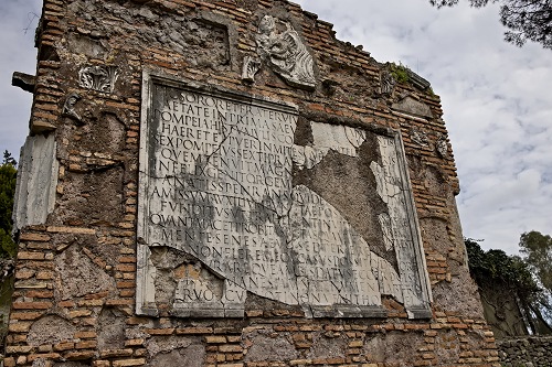
The inscription on Trajan's column is very good, nicely spaced, well carved and almost complete, but in my humble opinion another inscription, though somewhat less well preserved, has better letters. The monument to the children of Sextus Pompeius Justus.
Via Appia Antiqua
The Via Appia, or Appian Way, was one of the most important Roman roads, eventually connecting Rome to Brindisi in the 'heel' of Italy.
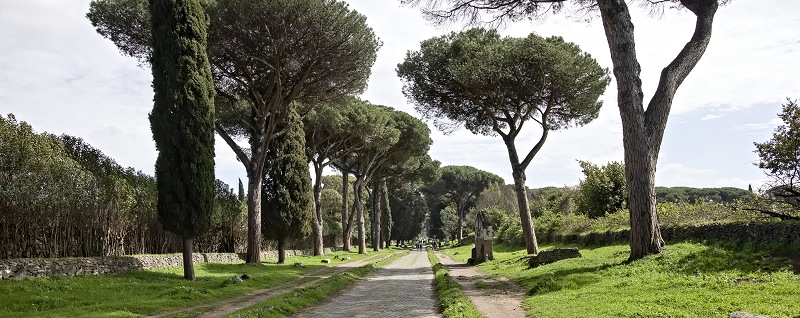
Early in the 1st century, just outside the city walls, the road ran through prosperous suburbs and many memorials were built alongside the road, including one to the children of Sextus Pompeius Justus. There is a good guide to some of the notable memorials on the road here.
 Partial translation from the link above:"A wretched father, Sextus Pompey, weeps the death before their time of a son and a daughter. He hoped, as nature's laws decree, to precede them to the grave; instead, grief-stricken, he was compelled to light their funeral pyre". He then movingly implores the Manes, deities representing the souls of deceased loved ones, to ensure that he may soon join them again."
The monument has clearly seen heavy damage and was reassembled in the 19th century. Nevertheless we can see the quality of the existing letters and how beautifully they have been cut. The letters are bolder than the Trajan inscription, but also deeper cut - meaning that the angle in the bottom of the V-shaped carved strokes is around 80 degrees. This gives the letters greater contrast. The letters on Trajan's column are nearer to 90 degrees, which is much easier to achieve with a normal straight tipped chisel.
When originally installed, the monument read as follows. The red text shows areas which do not survive:
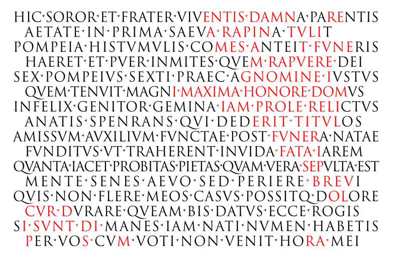
I tried to match the proportion of the whole inscription, matching line lengths and spacing. One line though jumps out. The second line as proposed in a book of 1854 and as far as I can see, accepted ever since, seems several letters too short. We will never know the true original wording.
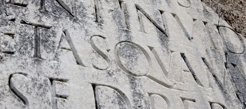
Today the memorial looks like this:
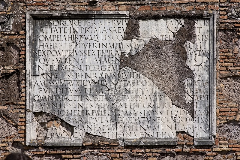
Visiting the memorial to the children of Sextus Pompeius Justus is something of a pilgrimage for letter carvers, so I was pleased (read - thrilled to little pieces) to be able to visit the site myself this year. I took a lot of photos, so if you need high resolution versions of these photos and more, drop me an email.