Home | Church list | Blog posts | Why PoorFrankRaw? | Contact | Shop
Carving letters on stone
I carve lettering on stone, by hand, using a hammer and chisel, the way the Romans used to do. I'm not sure who this page is aimed at, but here I describe some of the thinking and actions behind the process.
Why?
These days most of the lettering you see on stone is sand blasted or cut with a high speed router, and most modern headstones are made that way. But just as photography didn't replace painting and cars didn't replace walking, the old ways still work, and they offer greater room for artistry and flexibility.
I blame the Romans
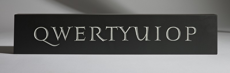
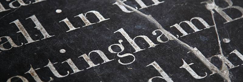
The Romans didn't have sand blasting, so they carved their letters using a hammer and chisel. The definitive style is generally accepted to be the inscription on Trajan's Column in Rome. There are other very good inscriptions elsewhere, mainly on the Appian Way, but Trajan is good.
There are many other common and less common styles of carved lettering, often based on known historical letter forms, Roman rustic, black letter, Lombardic, variations of calligraphic styles and many more. Some of these you'll see among my photos on these pages.
Fast forward to today and despite other advances in technology, hand carved lettering is still a thing. High status buildings and memorials these days still often use hand carved letters. You want a hand carved headstone? No problem, just go to Memorials by Artists.
Given that there are people who can carve such fantastic memorials, there must be a whole ecosystem of people teaching, learning, working with and studying hand carved letters. You want to take a course? Try John Neilson. You want to know about the broader world of calligraphy and carved lettering? Try Letter Exchange.
Beware of Youtube
Everything is on Youtube, for good or ill, but there are some terrible examples of hand carved lettering, plus a lot of examples using machine tools and sandblasting.
Meanwhile, here is some hand carved lettering on Youtube :) This is me quickly carving a slightly rustic capital I on an indifferent piece of limestone. Don't judge me:
That's all there is to it. Some letters are more complex, there are curves and straights, junctions and counters and swashes and slab serifs and it can get quite complicated, but the carving is similar thoughout. Chop, then chop some more, then chase, then carefully tweak all the fine details and you are finished.
Tools and materials
Materials
Imagine trying to carve something detailed on a big block of chalk. All soft and crumbly and lumps breaking off. Chalk is obviously too soft. Now imagine carving letters on a block of incredibly hard granite - it can be done, but it is not easy. In between chalk and granite there is a wide range of stones which are in the Goldilocks zone. Hard enough, but not too hard, fine grained enough to take good details, just right.
If the stone is slightly soft it is more difficult to cut a really crisp line - the edge of the cut tends to break away slightly. On harder stones the outline of the letter can be cut really crisply. Slate is unusual because it is made of layers of flakes of material and unless great care is taken these flakes can pull away, and leave a ragged finish. I complained to John Neilson, who taught me, that "slate punishes poor technique". He said, "ah but it rewards good technique". I changed my attitude to slate that day, slowed down and improved my slate letters as a result:
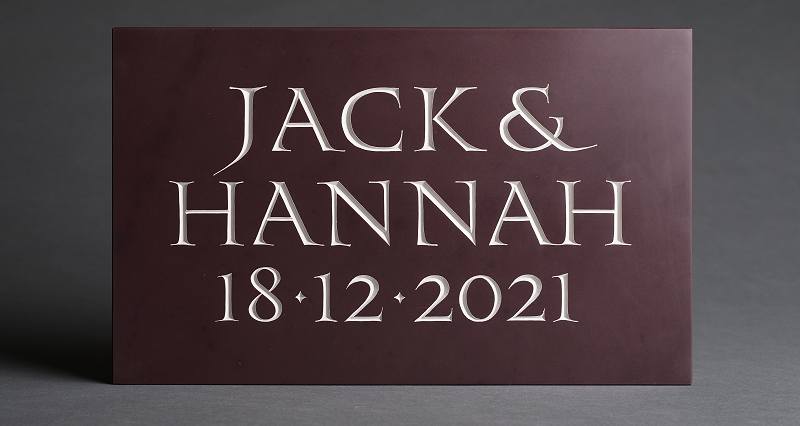
- Slate: Welsh slate ranges from grey to black, plus purple ('heather' - see Jack and Hannah below). Quality can vary but hard Welsh slate is lovely to carve. It is durable and resistant to moisture. Also Cumbrian green slate (coarser grained than Welsh) and Delabole from Cornwall.
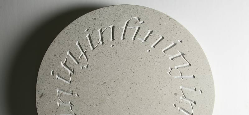
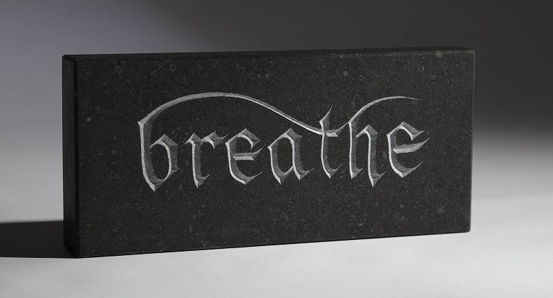
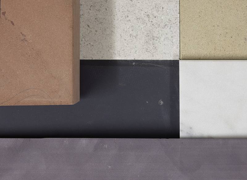
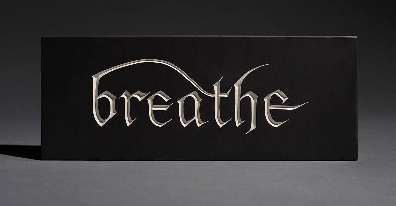
- Limestone: British examples include Portland, Purbeck, Hopton Wood (see 'infinity' above), and several others. They vary between slightly chalky to quite hard. Generally off-white, but there is also Kilkenny limestone from Ireland which polishes to very dark speckly grey/black - very hard and a bit coarse grained (see 'breathe' above). Nabresina and Aurisina from Italy are much harder and take very crisp detail.
- Sandstone: Generally coarser grained than limestone, British examples include York, Dunhouse and Caithness. Available in a range of cream/beige/yellow shades, but also (very soft) red sandstone.
- Marble: There are no true British marbles but Italian white marble is readily available. See '2022' below.
Stone samples: Clockwise from top left: Red sandstone, Nabresina limestone, Derbyshire sandstone, Italian marble, Welsh purple slate, Welsh black slate.
Tools
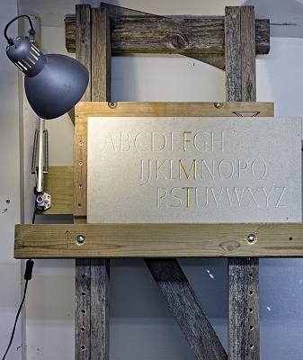 You'll need an easel to hold the stone. Not an artist's easel - way too flimsy. Something sturdy enough to hold a block of stone which could weigh 30 or 40 kilos. Mine is just pieces of 4 x 2" screwed together, but it is more sturdy than I need now - it was made to carry a headstone. The easel just leans against a convenient wall.
The cross piece under the stone can be lifted or lowered so you are always working with the chisel at a comfortable height. I like to have the chisel at about the level of my chin - ymmv.
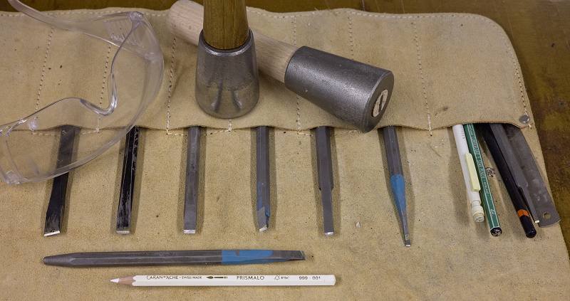
Then you'll need a hammer - known as a dummy, a couple of chisels, some hard pencils (black and white) and importantly, a pair of safety goggles. Don't be me - I got a limestone chip embedded in the front of my eye while carving, because I wasn't wearing safety glasses. A nurse spent two hours trying to wash it out in A&E, but that didn't work, so they scraped it out with a needle. At my next eye checkup the optician said, "yep, I can see the hole".
Spending £5 on a pair of goggles is a great investment.
After carving
Colour: Historic carved lettering was sometimes painted to make the letters stand out more, especially indoors where direct sunlight wasn't available to increase shadows and contrast. This is still done.
There are two techniques, paint inside the cut letters with a brush (slow and fiddly) or use spray paint over the entire inscription and sand off the excess from the surface:
Gilding: The inside of the carved letters can be gilded with gold leaf. First a coat of sticky varnish called 'size' is painted inside the letters. This is allowed to almost dry - when it reaches its maximum stickiness, and then gold leaf is applied. The surface of the stone is then lightly sanded to remove any stray size or gold leaf which has overlapped from the cut letters.
Filling: Sometimes wall-mounted memorials and ledger stones (set in the floor) are seen with filled letters. This can be a mixed blessing. If the filling stays in place, and if the colour of the paste or mortar gives a good contrast with the stone, it can be very effective. If the filling drops out, bit by bit, it can lose the effect and just look a mess.
This example from 1747, with white filling in good black slate, and beautifully cut letters, has kept most of the filling intact, though the large crack in the slab spoils the effect somewhat:
Oiling: Painting and gilding helps the inside of the cut letters, but sometimes the surface needs a hand to provide good contrast and readability (slate and Kilkenny limestone only).
After painting or gilding the stone, and giving the surface a wipe down with a clean, dry cotton cloth, I use a cotton pad to apply a very thin coat of oil to the surface. Rubbed in well, this darkens the stone and increases the contrast between the paint in the letters and the flat surface (see 'breathe' on Welsh slate below). I use a 40/60 mixture of linseed oil and turpentine. A little goes a long way. Try not to get the oil in the cuts.
Presentation
Having carved some lettering or bought a piece from a talented letter carver, you'll want to display it somewhere so it looks at its best. Light is the key. Ideally you want some side light, so the light glances across the surface and puts some light and shade into the cut letters. Side-on to a window or with an artificial light carefully placed will give good results. Flat or head-on light will give no shadow and kill the effect of the carving.